Promptus Logo Log In Sign Up Download

Navy #16223B Stone #EDE3CE and create icons bold size for this : Yes — **this …

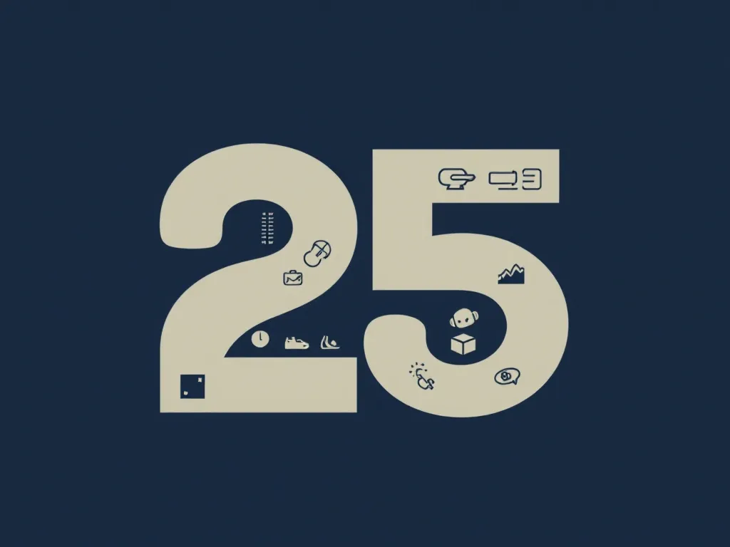
Navy #16223B  Stone #EDE3CE and create icons bold size for this : Yes — **this is the right direction**, but I would make one important change: **do not let the icons look like a collection of clip-art symbols placed inside the 25.** They should feel *architecturally embedded* into the number, almost as if the **25 itself is a visual timeline of Alfaisal’s 25 years**.  Based on the **original attached design**, I would build the internal icon language around five layers:  ### 1. LEGACY — what came before  Use very small, highly simplified line icons:  - **Najdi doorway / traditional door** - **Najdi window geometry** - **Traditional Riyadh mud-brick façade** - **Historic arch** - **Old manuscript / open book** - **Arabic geometric seal** - **8-point star** - **Traditional architectural column** - **Palm trunk rings** — subtle symbol of time - **Foundation stone / architectural block**  **Best placement:** inside the upper curve of the **2**, representing the foundation.  ### 2. SAUDI CULTURE — identity & place  These can make the logo feel much more connected to Saudi Arabia without turning it into a tourism logo:  - **Date palm** - **Palm frond** - **Sadu-inspired geometric weave** - **Najdi geometric ornament** - **Arabic calligraphic stroke** - **Traditional mashrabiya pattern** - **Saudi architectural arch** - **Desert horizon** - **Dallah silhouette — extremely minimal** - **Incense burner silhouette — extremely minimal** - **Falcon wing abstraction** - **Arabian horse head abstraction**  I'd use **only 2–4 of these in the final mark**. The rest belong in the broader icon system.  ### 3. ALFAISAL / EDUCATION — the 25 years themselves  This is where the identity becomes specifically **Alfaisal University**, rather than a generic Saudi anniversary:  - **Graduation cap** - **Open book** - **Lecture podium** - **Students** - **Research microscope** - **DNA helix** - **Atom** - **Laboratory flask** - **Engineering compass** - **Architectural blueprint** - **Knowledge tree** - **Academic laurel** - **Research paper** - **Library shelves**  **Turn the inner counter of the “5” into an open book.**  **25 → knowledge → university → legacy**  without needing an obvious icon sitting beside the logo.  ### 4. INNOVATION — where the identity moves forward  These should appear progressively as you move through the **25**, so the logo has a narrative:  **Past → Present → Future**  Use:  - **Circuit pathways** - **Microchip** - **AI node network** - **Atom** - **DNA** - **Robotic arm** - **Satellite** - **Rocket** - **Wind turbine** - **Solar symbol** - **Digital grid** - **Connected nodes** - **Abstract data wave** - **3D geometric cube** - **Upward trajectory arrow**  A **circuit pathway that begins inside the 2 and gradually transforms into an upward trajectory through the 5**.  That visually says:  > **25 years of knowledge → innovation → future**  ## 5. TIME — the hidden layer  This is the part I think could make your concept **much more sophisticated**.  Instead of simply writing **2001–2026**, subtly incorporate the idea of time into the 25.  Consider:  - **25 small geometric ticks** - A **timeline line** - **25 dots/nodes** - **Quarter-circle progression** - **Sunrise → sun → horizon** - **Palm growth rings** - **Hourglass geometry** - **Orbit** - **Circular progression** - **25-point micro-pattern**  The strongest solution would be a **very subtle 25-node timeline** embedded into the geometry.  Not obvious enough to distract—but meaningful enough to explain in the rationale.  # The BIG idea I'd recommend  Instead of treating the logo as:  make it:  ### **25 AS A VISUAL TIME CAPSULE**  The **2 represents the foundation**:  **Heritage → Culture → Knowledge**  The **5 represents the evolution**:  **Research → Innovation → Global Impact → Future**  And the transition between them represents:  So every internal element has a reason.  ## Suggested icon hierarchy inside the actual 25  I would use something like this:  | AreaIconMeaning |                            |                         | | --------------- | -------------------------- | ----------------------- | | Upper 2         | Najdi arch                 | Foundation              | | Upper 2         | 8-point geometry           | Heritage                | | Upper 2         | Arabic calligraphic stroke | Culture                 | | Middle 2        | Date palm                  | Saudi identity / growth | | Lower 2         | Open book                  | Knowledge               | | Transition      | DNA                        | Research                | | Transition      | Atom                       | Science                 | | Upper 5         | Circuit                    | Technology              | | Upper 5         | Graduation cap             | Education               | | Middle 5        | Students                   | People                  | | Middle 5        | Microscope                 | Research                | | Lower 5         | Architecture               | Built impact            | | Lower 5         | Globe                      | Global reach            | | Outer edge      | Arrow/trajectory           | Future                  | | Micro-detail    | 25 nodes                   | Time                    |  ---  # And I would add 6 "hidden" symbols  These are more interesting than obvious icons.  ### **01 — The Seed**  A tiny geometric seed hidden inside the **2**.  **Meaning:** the founding idea that became Alfaisal.  ### **02 — The Arch**  Use an arch as a negative-space element.  **Meaning:** entering a new chapter.  ### **03 — The Palm**  Not just a palm-tree illustration.  Make the **trunk itself part of the geometry of the 2**.  ### **04 — The Star**  A tiny eight-point star embedded into a geometric panel.  **Meaning:** knowledge, guidance and cultural heritage.  ### **05 — The Circuit**  Start with traditional geometric ornament and gradually transform it into a circuit.  **This is extremely powerful.**  It visually transitions:  **Heritage → Innovation**  ### **06 — The Horizon**  At the very bottom of the 5, use a thin horizontal line with an emerging sun/arc.   # One thing I would NOT do  I would avoid putting too many literal objects such as:  ❌ rocket ❌ microscope ❌ palm ❌ graduation cap ❌ building ❌ globe ❌ atom ❌ lightbulb  all together at equal visual weight.  That will make it look like an **infographic inside a logo**.  Instead, use **three levels**:  ### Level 1 — Primary  **2 + 5 geometry**  Palm / arch / book / research / innovation  ### Level 3 — Micro-language  Geometric patterns / dots / circuits / Arabic strokes / timeline marks

Prompt:

Navy #16223B Stone #EDE3CE and create icons bold size for this : Yes — **this is the right direction**, but I would make one important change: **do not let the icons look like a collection of clip-art symbols placed inside the 25.** They should feel *architecturally embedded* into the number, almost as if the **25 itself is a visual timeline of Alfaisal’s 25 years**. Based on the **original attached design**, I would build the internal icon language around five layers: ### 1. LEGACY — what came before Use very small, highly simplified line icons: - **Najdi doorway / traditional door** - **Najdi window geometry** - **Traditional Riyadh mud-brick façade** - **Historic arch** - **Old manuscript / open book** - **Arabic geometric seal** - **8-point star** - **Traditional architectural column** - **Palm trunk rings** — subtle symbol of time - **Foundation stone / architectural block** **Best placement:** inside the upper curve of the **2**, representing the foundation. ### 2. SAUDI CULTURE — identity & place These can make the logo feel much more connected to Saudi Arabia without turning it into a tourism logo: - **Date palm** - **Palm frond** - **Sadu-inspired geometric weave** - **Najdi geometric ornament** - **Arabic calligraphic stroke** - **Traditional mashrabiya pattern** - **Saudi architectural arch** - **Desert horizon** - **Dallah silhouette — extremely minimal** - **Incense burner silhouette — extremely minimal** - **Falcon wing abstraction** - **Arabian horse head abstraction** I'd use **only 2–4 of these in the final mark**. The rest belong in the broader icon system. ### 3. ALFAISAL / EDUCATION — the 25 years themselves This is where the identity becomes specifically **Alfaisal University**, rather than a generic Saudi anniversary: - **Graduation cap** - **Open book** - **Lecture podium** - **Students** - **Research microscope** - **DNA helix** - **Atom** - **Laboratory flask** - **Engineering compass** - **Architectural blueprint** - **Knowledge tree** - **Academic laurel** - **Research paper** - **Library shelves** **Turn the inner counter of the “5” into an open book.** **25 → knowledge → university → legacy** without needing an obvious icon sitting beside the logo. ### 4. INNOVATION — where the identity moves forward These should appear progressively as you move through the **25**, so the logo has a narrative: **Past → Present → Future** Use: - **Circuit pathways** - **Microchip** - **AI node network** - **Atom** - **DNA** - **Robotic arm** - **Satellite** - **Rocket** - **Wind turbine** - **Solar symbol** - **Digital grid** - **Connected nodes** - **Abstract data wave** - **3D geometric cube** - **Upward trajectory arrow** A **circuit pathway that begins inside the 2 and gradually transforms into an upward trajectory through the 5**. That visually says: > **25 years of knowledge → innovation → future** ## 5. TIME — the hidden layer This is the part I think could make your concept **much more sophisticated**. Instead of simply writing **2001–2026**, subtly incorporate the idea of time into the 25. Consider: - **25 small geometric ticks** - A **timeline line** - **25 dots/nodes** - **Quarter-circle progression** - **Sunrise → sun → horizon** - **Palm growth rings** - **Hourglass geometry** - **Orbit** - **Circular progression** - **25-point micro-pattern** The strongest solution would be a **very subtle 25-node timeline** embedded into the geometry. Not obvious enough to distract—but meaningful enough to explain in the rationale. # The BIG idea I'd recommend Instead of treating the logo as: make it: ### **25 AS A VISUAL TIME CAPSULE** The **2 represents the foundation**: **Heritage → Culture → Knowledge** The **5 represents the evolution**: **Research → Innovation → Global Impact → Future** And the transition between them represents: So every internal element has a reason. ## Suggested icon hierarchy inside the actual 25 I would use something like this: | AreaIconMeaning | | | | --------------- | -------------------------- | ----------------------- | | Upper 2 | Najdi arch | Foundation | | Upper 2 | 8-point geometry | Heritage | | Upper 2 | Arabic calligraphic stroke | Culture | | Middle 2 | Date palm | Saudi identity / growth | | Lower 2 | Open book | Knowledge | | Transition | DNA | Research | | Transition | Atom | Science | | Upper 5 | Circuit | Technology | | Upper 5 | Graduation cap | Education | | Middle 5 | Students | People | | Middle 5 | Microscope | Research | | Lower 5 | Architecture | Built impact | | Lower 5 | Globe | Global reach | | Outer edge | Arrow/trajectory | Future | | Micro-detail | 25 nodes | Time | --- # And I would add 6 "hidden" symbols These are more interesting than obvious icons. ### **01 — The Seed** A tiny geometric seed hidden inside the **2**. **Meaning:** the founding idea that became Alfaisal. ### **02 — The Arch** Use an arch as a negative-space element. **Meaning:** entering a new chapter. ### **03 — The Palm** Not just a palm-tree illustration. Make the **trunk itself part of the geometry of the 2**. ### **04 — The Star** A tiny eight-point star embedded into a geometric panel. **Meaning:** knowledge, guidance and cultural heritage. ### **05 — The Circuit** Start with traditional geometric ornament and gradually transform it into a circuit. **This is extremely powerful.** It visually transitions: **Heritage → Innovation** ### **06 — The Horizon** At the very bottom of the 5, use a thin horizontal line with an emerging sun/arc. # One thing I would NOT do I would avoid putting too many literal objects such as: ❌ rocket ❌ microscope ❌ palm ❌ graduation cap ❌ building ❌ globe ❌ atom ❌ lightbulb all together at equal visual weight. That will make it look like an **infographic inside a logo**. Instead, use **three levels**: ### Level 1 — Primary **2 + 5 geometry** Palm / arch / book / research / innovation ### Level 3 — Micro-language Geometric patterns / dots / circuits / Arabic strokes / timeline marks

Generated with the Bauhaus AI Image Generator AI model on Promptus. Try a prompt of your own.